
Client: Bitesize UX + Springboard
My Role
UX/UI Designer & Researcher
Skills: Research Analysis, User Flow Map, Lightning Demos, Sketches, Storyboarding, Rapid Prototyping, Usability Testing
Tools Used: Bitesize UX, Figma
Overview
Design Sprint: PostUp
Designed a mobile app for a fictional startup PostUp that gathers real-time needs of freelancers and remote workers and their preferences when working in public areas to suggest and provide a list of relevant public places for them to work from.
This project was a modified Google Ventures Design Sprint, with research and user data provided from Bitesize UX.
The Context
PostUp is a community of freelancers and remote workers who share tips and advice among each other. Recently, users have been wanting to share information about doing work outside of home, and to find good public places to do their work in between meeting times or for full-day remote work.
In times when users are out in unfamiliar parts of town, it becomes difficult to find the right place to “post-up” and get down to work. In order to comfortably produce some work, users need good Wifi, access to outlets, and a bathroom to use; by which, are hard to find sometimes. Even if a place may have all the good amenities, that could also result in the place being overly crowded and noisy, which isn’t suitable for making phone calls/video chats for the users.
What and Why?
The Question
How might we allow users to quickly find a public place to work at by providing information on user needs/wants like amenities, open seats & tables, and a visualization of the physical space itself?
Problem Statement
The Solution
Introducing

Final Solution
Helping users to quickly find a place to work from, at a place that meets their preferences of amenities and needs at the moment.
Design Sprint Process
The Approach
Day 1: Map
Bitesize UX provided pre-collected research data from PostUp’s users through survey, interviews and a persona to showcase their characteristics and needs.
Collecting & Analyzing Data
I went back and analyzed the research data to determine key areas of user needs, to better focus and narrow the problem into HMW statements that would help me move forward with my design process.
Wifi seems to be the biggest concern, alongside outlets and bathrooms
Users may care about the purchases they would have to make in order to stay in specific places (e.g. cafe)
Users struggle with finding the right work-friendly places in an unfamiliar area of town
Survey Main Takeaways
Understanding the Core Users: Persona
Meet “Nina”
Works remotely; utilizes public spaces to work outside of home occasionally (~3 days a week)
Wants to spend less time finding places to work from, and more time getting work done
Often has free time in between client meetings, and tries to find places to get some work done or make a phone call
Spends a lot of time doing research to find a place to work at when visiting an unfamiliar location
Wants to find places that have the basic amenities and a work-friendly environment (e.g. not too noisy or crowded)
Gets frustrated when a location does not have clear indication of its amenities (e.g. wifi, bathrooms, etc)
Nina
32 yrs old | Freelance Copywriter | Boston, MA
Core Characteristics & Needs
1
2
3
4
5
6

Current Methods
A user interview data was shared to gain insights into how users currently find public places to work from, and what sort of resources and methods they use to make the process as efficient and quickly as possible.
Would be nice to see busy times in terms of how many seats & tables are available
There isn’t a specific way to find out a location’s amenities; only way is to dig through lots of reviews sometimes
Maps help to determine distance, which is important, and is easier to visualize where places are
Interview Main Takeaways
User Map
How might we allow users to quickly find a public place to work at by providing information on user needs/wants like amenities, open seats & tables, and a visualization of the physical space itself?
HMW Statement
Circling back to the Problem
Imagining the Solution
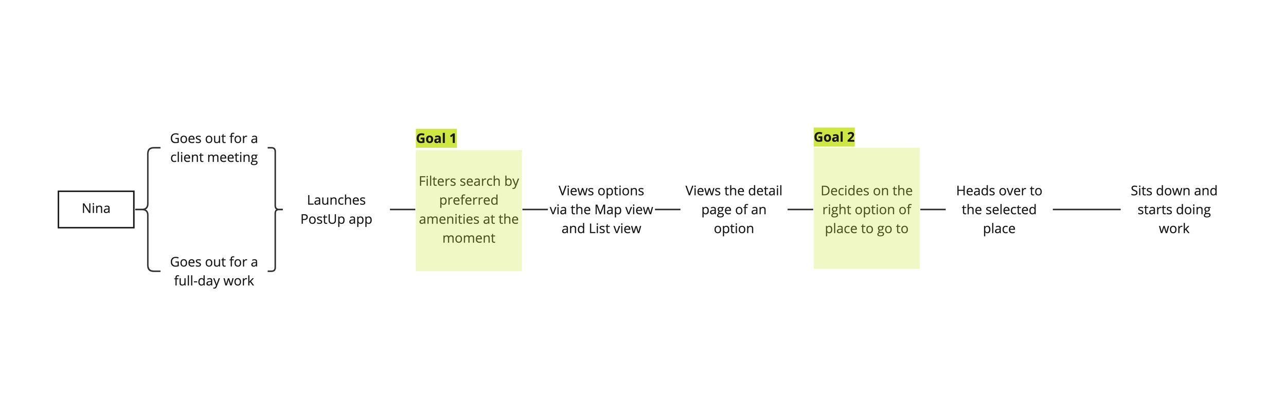
A user flow for a solution was imagined to kickstart the ideation for the next step, Day 2. This helped to organize what pain points to target and what goals could help achieve those targets.
Day 2: Sketch
Lightning Demos
Day 2 began off with lightning demos, where I researched existing mobile applications and designs for inspirations, opportunities, and explorations for experiments.
1. Zillow


Onboarding Survey
Map + List Views w/ Filters
Helps to gather user preferences and to start a search for possible options.
Helps users to view the distance/location, amenities, and photos of the physical space. Search can be modified to narrow down in finding the right option for the users
2. iOS Weather App
3. Google’s Busy Time Graph


Reflected the cognitive flow of mobile users efficiently through strategically organized information down the screen (Items listed vertically by level of importance.)
Horizontal scroll is used to show change across time, which could be used for showing busy times for this project.
The graph simply visualizes how busy a place is by time. This is either live or data-based, which can be implemented as availability for PostUp’s app, to show the open seats and tables instead
Crazy 8s
To reflect upon the user needs from research with the inspirations from above, I sketched out 8 versions of the critical screen of Goal 1: Filtering Search by amenities (from User Map), which is where users can determine what their preferences/needs are at the moment, ultimately reducing the time and effort needed to dig through lists and reviews.
The Ideation

Solution Sketch
Following the Crazy 8 sketches, I selected one sketch that represented the needs of the critical screen the most. I decided to design the app’s main solution from number 2 from above because it showed the ability to filter their preferences by situation, which would make this process more personable and relatable.
The Solution Sketch starts off from the selected screen, and sketching what would come right before and after it.
Imagining the Final Solution
1
2
3
4
5
6
7
8

1
2
3
1. Onboarding: Check location, and prioritize amenities to show best relevance in search results
2. Work theme: Determine what the user wants to achieve that day to provide the options
3. Map + scrolled list – Users can view a list of options as well as those options on the map to see distance.
This series of sketches visualizes the onboarding step of prioritizing the amenities the user needs flows well into the step of setting up the work style the user is looking for at the moment.
With this information, the app can provide a list of places that matches the needs of the user.
Day 3: Decide
Storyboard
Day 3 was spent wholly sketching out a full storyboard, to visualize the flow of the user finding a place to work at, through filtered searches, map views, as well as interactions with another user.
Since PostUp is a community-based app where the users are supposed to share and advise one another, I added interaction with one another to help each other to find out if a place would be the right choice for remote work.

Day 4: Prototype
High-Fidelity Mockups
Day 4 was spent to create and develop high-fidelity screens for PostUp. The prototype consists of the basic red route for the user, going through their main goals of quickly finding a place to work at, that meets their standards of amenities and needs of the moment.
The color/font were picked from the iconography and style given through Bitesize UX’s logo for PostUp. Design decisions were made directly from research and the needs of Nina (the persona), alongside the insights pulled from Day 2 and 3’s sketches and storyboard.


Moving into testing in Day 5, the target questions I had in mind for this prototype were:
Can users navigate through this app intuitively?
Do users feel lost at any moment in the process of finding the right place to settle down in?
Are the target emotions achieved? – Quick & easy, feeling informed, and feeling satisfied
Day 5: Validate
Usability Testing
On the final day of this Design Sprint, I conducted a series of usability test rounds with 5 participants, all who had experience with doing remote work outside of home at one point. All participants remembered the frustrations with finding a place to work in, including things like lack of space, noise levels, lack of outlets, and distance issues when trying to find a place to work/study.
Participants were given a scenario and 3 main tasks to complete for this testing.
Scenario:
You’re a freelancer who wants to do some work outside of home
You have a client meeting held in a part of town that you don’t normally go to, so you’re not very familiar with what places are going to be around you
You want to use PostUp to find the right place to go to.
Tasks:
Go through the Onboarding process to set up your preferences.
Take a look at one of your search results, and see if it matches your preferences.
Double-check the availability of the place. For the sake of this activity, let’s say there are other users using this app around town. Request to see if any of them can confirm the availability of the place
Usability Test Main Takeaways
Confused with “priority needs,” — they’re options that everyone would want, and rarely leave out of their “needs.”
A clearer message could be sent on the first Onboarding page — perhaps a ranking system would be better to show priority itself.
→
Thoughts Moving Forward
The map view with the location pinpoints could become an interactive button to lead into the detail view of a place.
→
Wondered why the map was not as interactive as it could be — no clicks were possible from the map itself
Conflicting thoughts about if other users would actually confirm the availability just because they’re nearby
It may require an assumption within the scenario alongside the prototype to validate my design — e.g., “Let’s assume that PostUp is widely used in this city…”
→
Reflection
Short time doesn’t mean poor quality, and with this time crunch, I was able to pull my focus out to the fullest, efficiently using my time and resources to push through each day of activities. I feel like I gained the most during Day 2 and 3, where I had to force myself to flesh out a lot of sketches and ideas in order to move forward. I had a lot of fun running this sprint, and I feel like I gained growth in ideation, evaluation, and rapid prototyping skills.
Moving forward, if I had more time to work on this project, I would definitely start off with a redesign session to reiterate on the parts mentioned and questioned through the usability test rounds. Which then would lead into another set of testing rounds, solidifying the product further.