My Role & Project Details
UX Designer/Researcher
Client Company: Reckit
Timeline: Jan 2023 - Feb 2023
Team: 4 UX/UI designers, 2 Developers, 2 Co-founders
Skills: User Research, Interviews, Heuristic Evaluations, Affinity Maps & Research Synthesis Methods, User Flows, Wireframes, High-fidelity Prototypes, Usability Testing
Tools: Figma, FigJam, Optimal Workshop
Problem & Solution Overview
UX Audit for Reckit
Reckit is a new social media app where users can share various recommendations across a variety of categories to one another. Reckit has been on the app stores for about a month, and needed a UX perspective on its data (UX Audit) to improve the experience for users.
Thus, my team decided to focus on improving Reckit’s ability to shape a community for the users to feel inclusive and relevant, while seamlessly interacting with one another within this social media platform. We also redesigned parts of the app to make it more user-friendly and more consistent.
Project Timeline
Methods Used
Competitive Analysis & Heuristic Evaluation
Analytics Review
Usability Testing & Interviews
Settling into the Problem Space
Research Overview
To make sense of what our goals will be and how we will approach them, the team decided to utilize various research methods to uncover important aspects of this project like major pain points, competitors’ heuristic measurements, Reckit’s heuristic measurements, and Reckit’s current users’ common flows (via Analytics). Our findings can be seen below:
Main Takeaways
1. Reckit’s Weaknesses in Heuristics
Content Language does not match with real-world language
Lack of flexibility/efficiency of use (X customization/personalization)
Unlabeled icons/ambiguous visuals lacking recognition
1a. Competitive Analysis Diagram
“What are these icons? I recognize some, but some I don’t know what they’re for.”
“Past the login, the onboarding process was quick and smooth.”
2. Reckit App Analytics Evaluation: Major Routes of Users
Onboarding for New Users (Sign-up process)
Homepage + Add a New “Rec”
Follow Other Users
Usability Testing & Interviews Main Quotes
“The homescreen feels really congested. My eyes don’t know where to go first.”
“Who are these people suggested in the following section? These people aren’t in my contacts so why do I see them?”
Research Synthesis & Brainstorming
Pain Points & Opportunities
After the research, we were able to define a set of pain points from our users, and the opportunities that we can identify from those pain points.
The Pain Points
No personalization in the app
The Opportunities
Preference set-up during onboarding process
No separation between friends and strangers when following
Clear separation between contacts and non-contacts
Overwhelming list of categories
Effective filter system
Lack of sense of community as a social media platform
Grouping or giving users a sense of belonging
The Problem Statement
↓
“How might we give users the appropriate tools to share their personal interests and expertise to shape a community?”
Ideation from Research
Sketches and Prototypes
“How can I implement these research insights into ideas for redesigning Reckit’s user flows?”
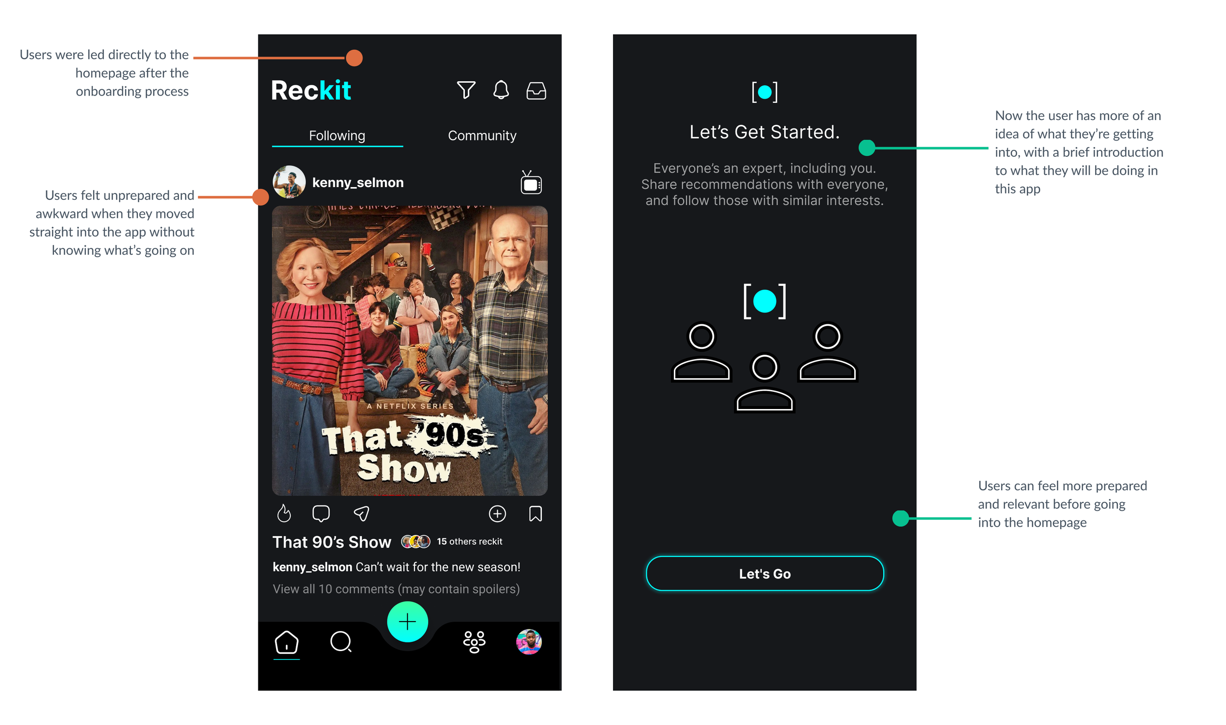
1. Onboarding for New Users
2. Homepage & Add New “Rec”
3. Follow Other Users
↓
Iterated Prototypes
Card-Sorting
Participants seemed to be grouping media/entertainment items together, then eatery items, and then travel items. Thus, we created three big categories to group: Dining, Entertainment, and Travel.
1. Onboarding for New Users
2. Homepage & Add New “Rec”
3. Follow Other Users
Testing & Iteration
Prototypes and Validation
Usability Testing
The team conducted usability tests to determine these following goals from the prototypes:
Identify friction points/areas for improvement in the prototype (within the usability aspects)
Determine if the users are experiencing the target emotions (defined in research)
Iterations and Redesign
1. Onboarding
2. Homepage
3. Add New Rec
Iterated Mid-Fidelity Prototype
For a better view, use Full Screen mode. ↓
Moving forward from our usability test results and findings, we as a team went through a thorough iteration and redesign. The ultimate goal message we wanted to carry across the prototype was: providing users with the tools to shape a community while sharing recommendations.
Concluding the Project
Reflection
Reckit may be a very new & may not be known widely yet, but it has the true potentials to shape communities and increase return rates from new and existing users
As we all know as human beings, we love to share opinions, thoughts, interests, and personalities with one another.
Reckit is an app that directly reflects those basic instincts for us modern people.
Next Steps
If I had more time…
If I had more time to spend with the company and this project, I would dive deeper into the following:
Testing and researching further into the blind spots and/or new friction points that may have occurred in the process of prototyping
Developing and updating the app’s Design System, with a more user-friendly & accessible UI Design


