Purdue University UXD Experience Studio III
Industry Sponsor: Sezzle
Timeline: Aug 2021 - Dec 2021
My Role
UX/UI Designer & Researcher
My Team: 7 UX/UI Designers,
Sponsors from Sezzle: Senior UX Designers & Dev Team periodically joining meetings
Skills: User Research, Interviews, Heuristic Evaluations, Affinity Maps & Research Synthesis Methods, Journey Maps, User Stories, UX Workshops, Wireframes, High-fidelity Prototypes, Usability Testing, Value Proposition
Tools: Whimsical, Figma, Miro
Sezzle: Reimagining In-store Shopping with Buy Now, Pay Later (BNPL)
Overview
This project was provided by Sezzle to my design team to tackle the following project: reimagine the current way of in-store shopping while utilizing Sezzle’s Buy Now, Pay Later (BNPL) service. We designed an integration to Sezzle’s mobile app to be utilized before, during, and after shopping in-store, to enhance and empower users within their shopping experiences.
About Sezzle
Who?
Sezzle is a fintech company that provides its users with a payment option to buy now, and pay later. Users are prompted to pay 25% forward (“down payment”), and pay the rest in 3 installments bi-weekly.
To learn more about Sezzle and their services, visit their website here to find out.
What?
The Context
Currently, many stores nationwide have made installment payments (not only Sezzle, but with other competitors as well) available to be used in-store. However, Sezzle has challenged us to completely reimagine the standard in-store shopping experience, while seamlessly incorporating the BNPL service into it.
Sezzle wanted to think about the future of in-store shopping and how it could change, alongside the rapidly-growing natures of technology and society. Within that growth, they wanted to see how BNPL service could be integrated and utilized, which was our goal to tackle and answer.
Opportunity Statement
The Goal
“Current Sezzle users using the Buy Now, Pay Later technology need an intuitive feature in the Sezzle app that enhances the way people currently shop in-store.”
Final Design Preview: The Scan & GO
Understanding “BNPL” and In-Store Shoppers
Research Overview
We first wanted to align our understandings of the following in-store shopping and friction points that occur when shopping in-store and utilizing Buy Now Pay Later (BNPL)* services.
*BNPL: Short-term financing that allows consumers to make purchases and pay for them at a future date.
The two key topics that we wanted to focus on were in-store shopping technology and consumer shopping behavior. The main goals that allowed us to achieve this focused understanding were as follows.
Understand BNPL services and Sezzle’s Unique Selling Points
Determine how competitors are outstanding and/or needing improvements
Understand how consumers shop and how they interact with various technology in-store
Identify what parts of the in-store experience Sezzle currently and could potentially impact
1. Participatory Observations
We conducted participatory observations in order to gain first-hand knowledge of how Sezzle operates and impacts within the current in-store shopping ecosystem. Simultaneously, we started to identify the general in-store pain points overall.
We conducted participatory observations in order to gain first-hand knowledge of how Sezzle operates and impacts within the current in-store shopping ecosystem. Simultaneously, we started to identify the general in-store pain points overall.
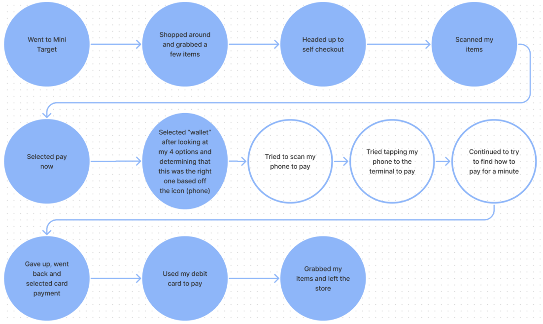
To achieve our goals, each member of the team set up Sezzle on their phones and attempted to shop in-store at Target (a partnering company with Sezzle). Team members then recorded their experiences as a flowchart (image below).
Takeaways
Sezzle impacted the in-store experience mainly during the checkout process
Most of the pain points occurred with the payment kiosks/POS machines and their errors
Misalignment of terminology happening between Sezzle’s in-app instructions and the actual payment kiosks
2. Competitive Analysis
Following our participatory observations, we were curious to see how and where Sezzle stood out among its competitors, to see the unique selling points of Sezzle and its potential to expand or change their current technology and designs.
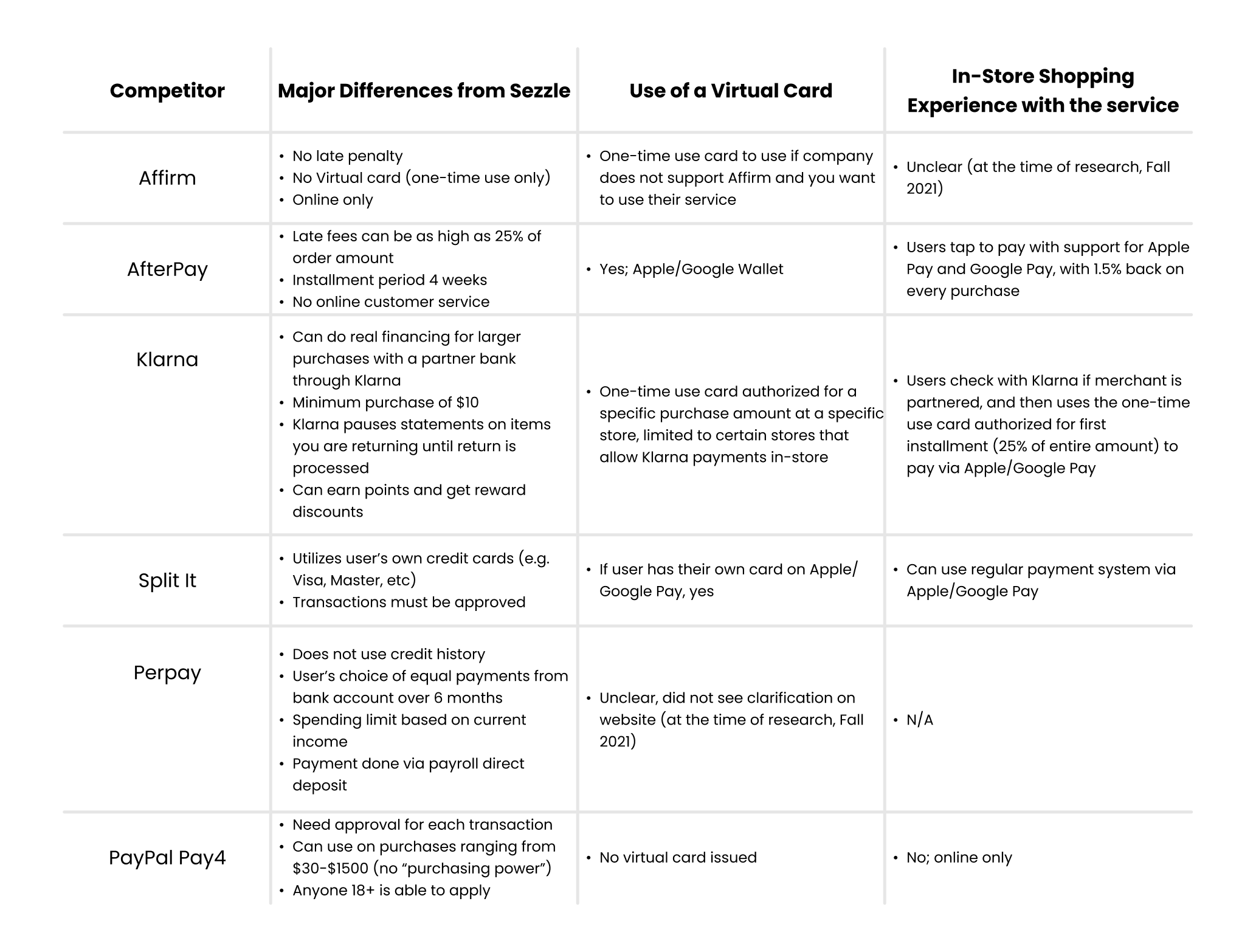
To achieve this, we looked into 6 competitors that were most used in the U.S., and evaluated how they can be compared in terms of the service Sezzle currently provided to its users. The three evaluation points were:
Main Differences from Sezzle
Use of Virtual Cards (Apple Wallet, Google Wallet, etc)
In-Store Shopping Experience with the service
Takeaways
Sezzle’s virtual card provides similar services, with more flexibility than some of the competitors
Most of the BNPL services are exclusive to online and generally have minimal or restricted in-person use
Ideation & Sketches
Brainstorming from Research
“How can we implement these research insights into ideas for an innovative in-store shopping experience?”
Going into ideation, the team wanted to utilize our research findings and think into the area of check-out and payment experiences, which were the most prominent areas of pain points, as well as the core touchpoint of Sezzle’s BNPL service.
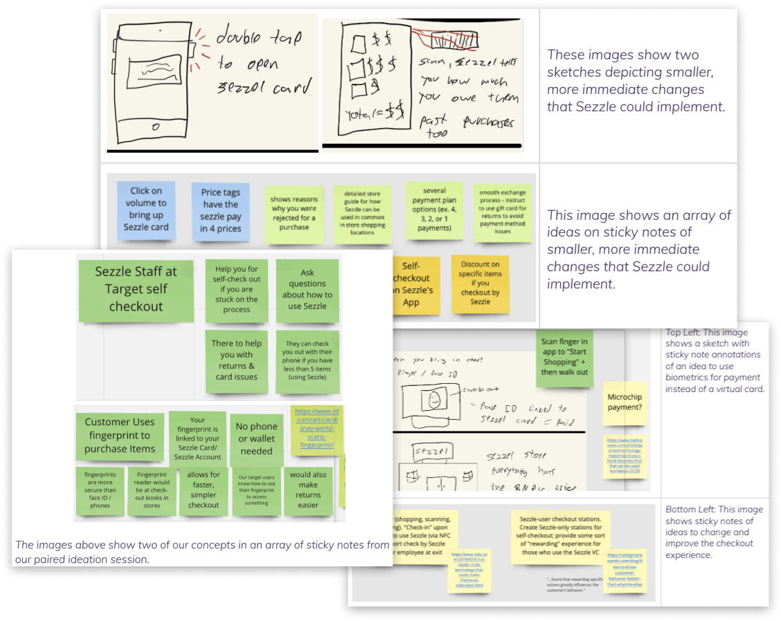
We went into a wide variety of sketches and ideas, from small-scale solutions that were immediately implementable, to large-scale ideas that required big changes within Sezzle as well as its partnered merchants. From these initial sketches, we were able to narrow down a bit further, to software-based, physical space, and combination of both.
For these rounds of ideation, we as a team took a unique path: we ideated across a wide variety of subjects/technologies, and followed-up those ideas with secondary research. For all of the ideas below, they each contain the following:
Research insights: The research findings that support the idea
Pain Points: The pain points from research that the idea would be able to address
1. Physical Space-Related
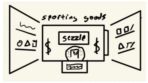
Sezzle-specific checkout kiosks; an idea if Sezzle were to become a very mainstream method of payment.
Research Insights: Efficient checkout, faster traffic (pain point: long lines, long waits; prefer self-checkout)
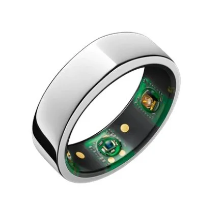
Sezzle payment bracelet; geofenced bracelets to notify Sezzle mobile app at entrance of the store, and can be utilized like a digital wallet for Sezzle
Research Insights: Faster checkout (pain point: long lines, long waits; slow payment systems), for privacy concerns, add PIN to confirm payment
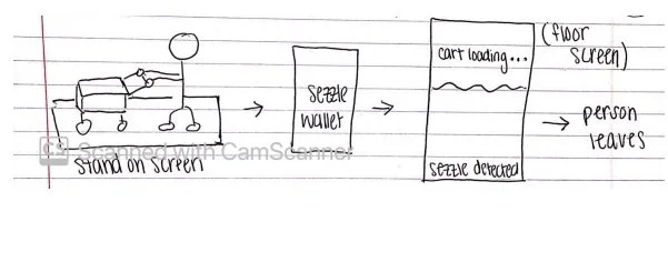
Speculative idea for auto-screening system in-store; a floor-set scanner to scan items in-cart and user’s Sezzle app (already pulled up) and finalizes checkout
Research Insights: Driven from a TikTok video; efficient checkout, no need to scan every item (pain point: long lines, long waits; prefer self-checkout)
2. Software-Based
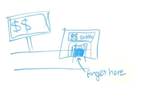
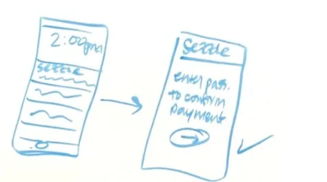
Speculative idea of a biometrics system: scan finger at checkout kiosk, get notification in-app & confirm payment
Research Insights: Secure, faster checkout (pain points: slow payment systems; POS errors)
Sezzle in-app idea for maps/item location info for specific partnered merchants (for example, Target), with payment system in-app as well — could make shopping more efficient & faster
Research Insights: Faster shopping, faster checkout (pain points: delayed shopping experience; slow payment systems; POS errors)
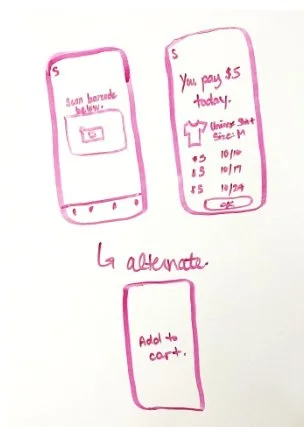
Scan barcode of the item you want in-store, and Sezzle app shows how installments will be split
Research Insights: Knowledge of financing, awareness of entire price (pain points: not knowing how much you’re spending until checkout)
3. Combination
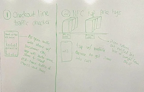
Checkout line traffic: Sezzle app geofences stores and senses when you’re in a specific store, notifies you of the length of checkout lines
NFC tap price tags: price tags can be tapped with mobile app, added to cart in-app, and paid for
Research Insights: Faster shopping experience, faster checkout, awareness of line traffic (pain points: long lines, long waits; delayed shopping experience; prefer self-checkout; slow payment systems; POS errors)
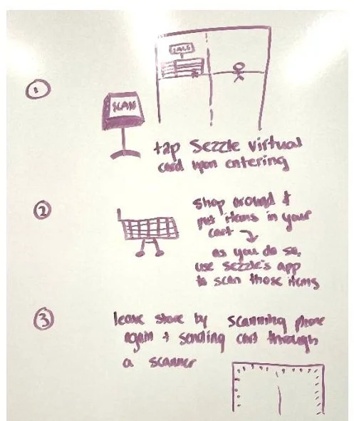
Kiosk in doorway to scan/tap Sezzle virtual card; then, app can be used to scan & pay for items — a scanner system can be utilized to align physical cart items with the in-app cart items
Research Insights: 73% of consumers want to use self-service technologies, faster checkout, faster lines (pain points: long lines, long waits; prefer self-checkout; slow payment systems; POS errors)
Takeaways & Decisions
Client noted: They preferred that we narrow down to design solutions within Sezzle’s mobile app, thus a software-based solution
Users' frustrations mostly seemed to derive from software issues at the POS system
Focus on the checkout process, as Sezzle's business model is centered around payment and checkout.
Narrowing & Focusing
Refocusing our Project
As our team narrowed and focused the problem scope down into software-based solution to be implemented into Sezzle’s app, our team took all our previous software-based ideas, and used them as inspiration as we furthered our ideation process.
At this moment, we as a team felt that we lacked the solid ground of understanding the specific, detailed pain-points of our users. Thus, we decided to take a few extra steps to further empathize with our users.
1. Pain Point Survey
The team created and sent out a survey to gather information of which pain-points were most prominent during an in-store shopping experience, specifically within the check-out process and payment systems.
We surveyed 50 participants, and asked questions relating to frequency of grocery shopping, preferred method of payment, frustrations at check-out, possible solutions they would like to see, and the involvement of a mobile device for the possible solutions. The most common responses relating to pain points were as follows:
2. Pain Point Scoring Activity
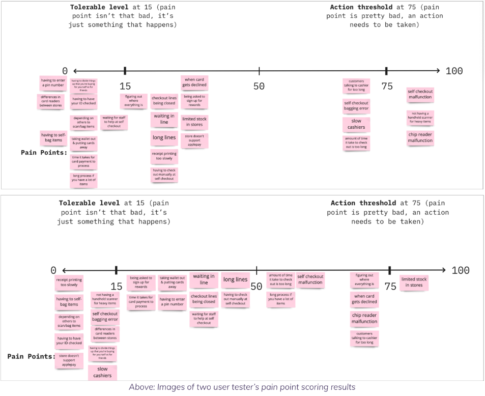
With these findings, we wanted to really narrow further down into one specific area to work upon through a scoring activity with 15 participants.
We set up a scale of 0-100: 0 = not a problem, and 100 = the absolute worst. To maximize the efficiency of the activity, we also utilized mid-points at 15 & 75: 15 = tolerable level, and 75 = action threshold.
From this activity, we were able to gather the top three pain-points from the in-store checkout process:
1st: Card declined - 9 participants
2nd: Self-checkout POS malfunction - 8 participants
3rd: Card reader malfunction - 8 participants
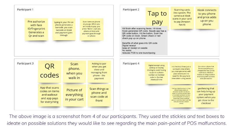
3. Collaborative Ideation
To utilize our findings to the fullest, we went into another round of ideation with a twist: collaborative ideation with potential users of Sezzle, outside the design team.
The criteria for the ideation was involvement with checking out in-store and in relation to a POS malfunction.
4. Idea Evaluation & Mini Research
After ideation, the team researched relevant technical information about the ideas and discussed which ideas to move forward with.
The purpose of this activity was to discuss technical feasibility and limitations of our ideas, as well as come to a consensus on the ideas we would be moving forward with to start wireframing.
Takeaways & Decisions
Participants wanted a way to use their mobile phones as the touchpoint for shopping, scanning, and paying
Common factor in the ideation: participants wanted to solve POS malfunctions via a “Scan and Go” system.
Decided “Scan and Go” would be a feasible solution as the technology required to implement it already exists
User Journey Mapping
Following the Future Steps of our Users
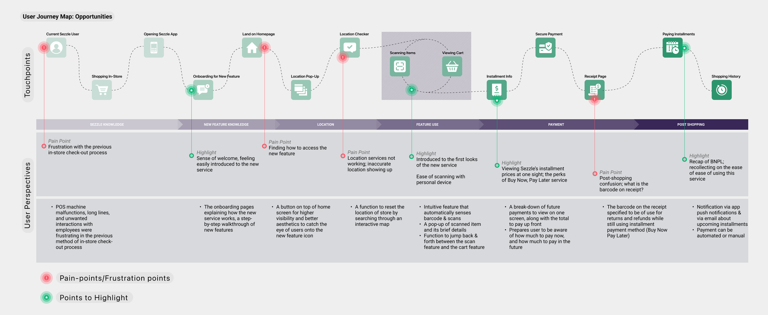
As we solidified our project’s direction and the needs of the users, the team created user journey maps to see the end-to-end experience of an in-store Sezzle user, going from pre-shopping experience up to the post-shopping experience.
This was something that I personally took leadership over. I separated the maps into two parts: needs and opportunities. The 'Needs' map shows the actions and questions of the user while interacting with a touchpoint; the 'Opportunities' map shows the user’s perspectives and emotions at the touchpoints, like pain-points to address and opportunities to highlight.
Click on image to view on a new window.
The 'Needs' Map
The 'Opportunities' Map
Mid-Fidelity Prototypes
From Ideas to Prototypes & Testing
With broader knowledge and understanding of the needs of our clients and the users, the team transitioned into designing and prototyping the functionalities and features for the new Scan & GO service.
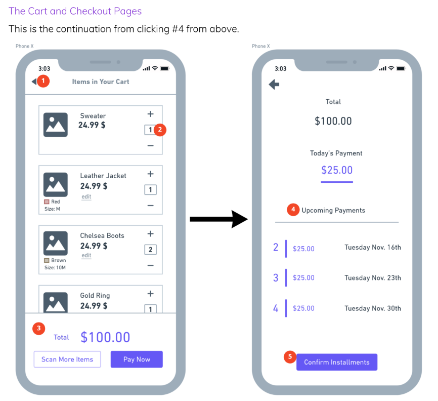
The screens below were the first version of our mid-fidelity mockups that carried our message and intentions through simplified UI and visuals. Each screens are annotated to provide detailed understanding.
From the pain-points and opportunities we identified through research and journey mapping, the team decided to focus on four main touchpoints (red routes):
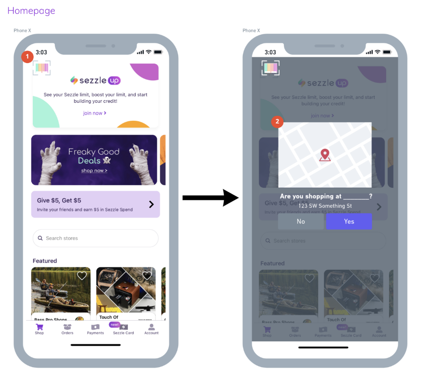
Homepage: Notifies users of a new service: Scan & GO
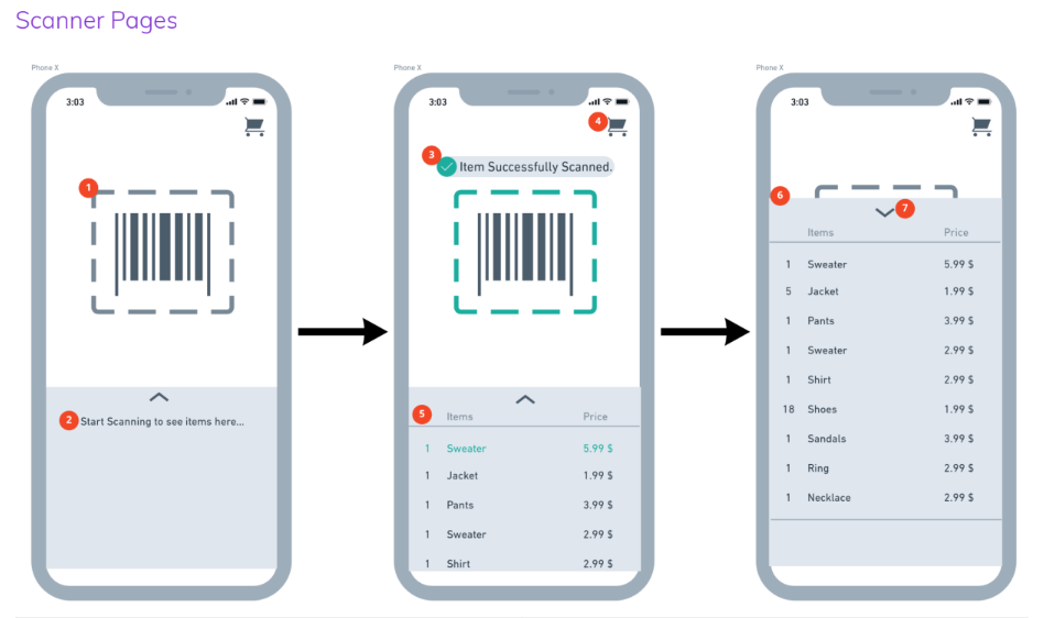
Scanner Pages: Accesses user to the Scanner feature of the new Scan & GO service
Cart/Checkout: Prompts user to utilize Sezzle’s installment payment plans to finalize shopping
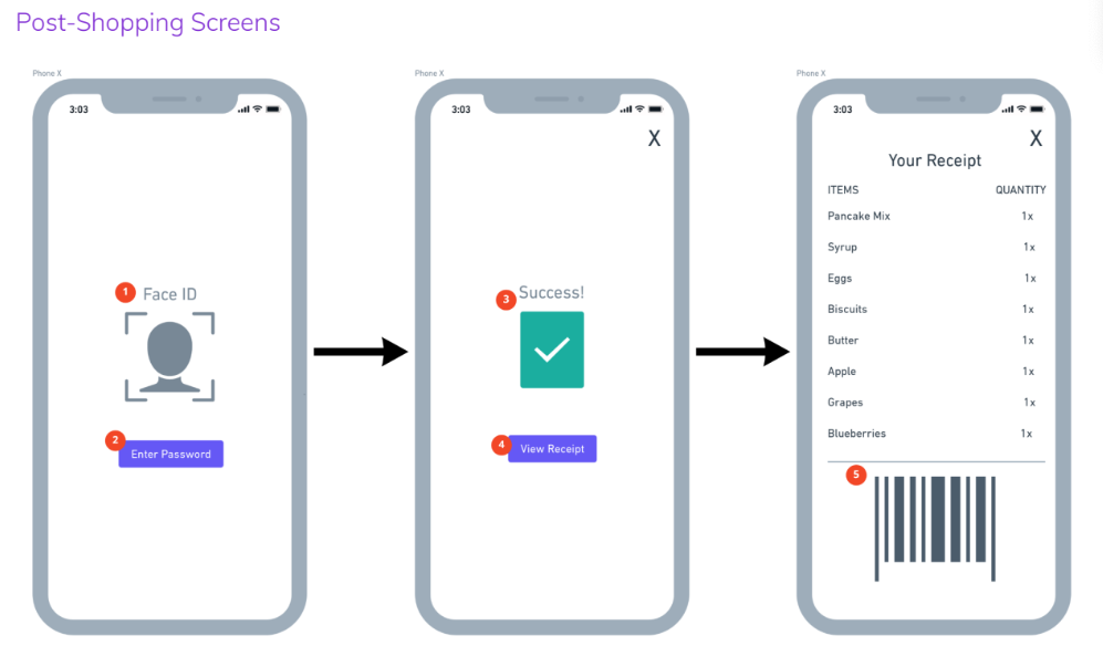
Post-Shopping: Notice of installments, and a receipt to exit the store
Mid-Fidelity Mockups
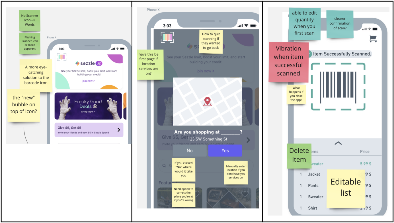
1: Scanner icon button in the top left corner for users to access the new Scan & GO service. The interaction was made as simple as possible, to avoid making another section in the menu bar, or entering whole new page.
2: Users with location settings on can check if the app detected the correct store to start the Scan & GO.
1: The scanner will automatically start scanning once it reads a barcode within the dashed box. There is no need for the user to go through long lines to checkout.
2: This area would start filling in as the user scans more items.
3. The user is visually and verbally notified with successful scans and cart additions.
4. User can access their digital cart to align it with their physical shopping carts.
5 & 6. List of in-cart items: user can find out quickly what’s in their cart.
7. Swipe up/down to easily go between scanner and in-cart list.
1: User can always go back to scanning from the cart view.
2. If purchasing multiple quantities of the same item, user can select how many, instead of scanning multiple times.
3. The subtotal is updated every time an item is added to cart.
4. At digital checkout, user is notified of the installment payment plans.
5. User can review the overall payment plans and prices before confirming them.
1 & 2: User can easily access their Sezzle accounts via digital wallets.
3. User is given a clear, visual success message after payment plan is confirmed.
4 & 5. User can view the receipt & scan it on their way out with the partnering store to double-check and exit.
Usability Testing
Now that we have the first draft of our new feature Scan & GO, we wanted to go through testing to validate our ideas, and to identify areas for improvements and positive areas to highlight and upgrade.
We as a team tested with 7 participants, given the task to imagine they’re shopping in-store (Target), use this service to track their cart, and to ultimately pay through Sezzle. Our goals for testing were as follows:
Understand how users interact with each page
Determine if user pain points are addressed
Identify any confusion regarding the navigation of our solution
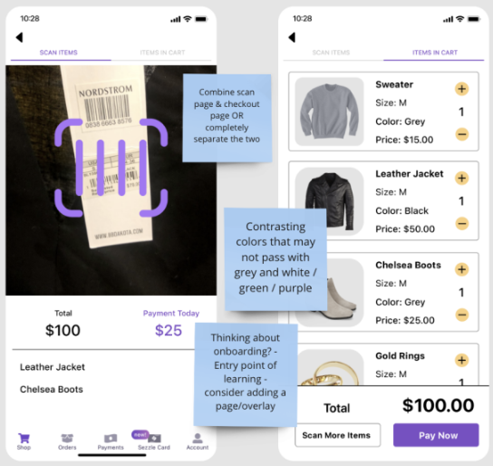
A/B Testing with scanner & cart pages (two versions tested): should they be on the same page, or separate?
Main Takeaways
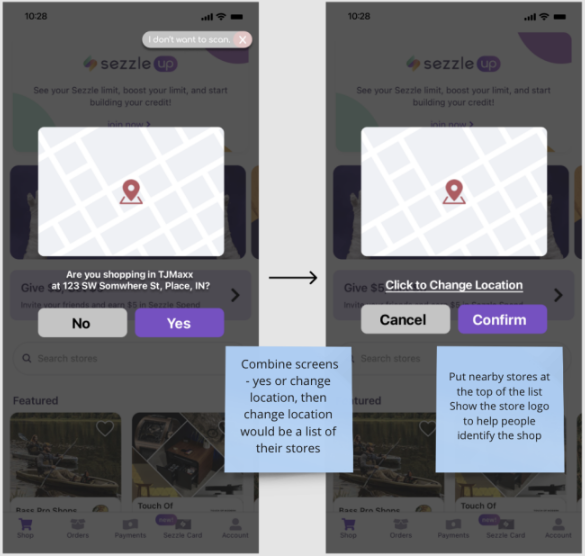
Users had issues with the geofencing feature (location services) especially if the user wanted to change store locations
Users found the onboarding process of the application confusing and hard to navigate
Users were not able to exit out of the scanning feature once they started
Users wanted to be able to edit their list of items without opening up a dedicated cart page
Transition into High-Fidelity
Iterations on Mid-Fi
Following our usability testing and findings, the team reevaluated our prototype and identified areas to improve, add, and highlight. The biggest changes that followed our mid-fidelity to our high-fidelity were as follows:
Onboarding: We added an onboarding process to introduce the new feature with a demo to allow users to familiarize themselves with it before using it for the first time.
Results of A/B Testing — Scanner + Cart Page: We decided to combine the scanner and the cart pages into one area so that our users can easily access both without going back & forth between two separate pages.
Clarification & Upgrade on Store Locations: We redesigned the store locating pages so the users can see nearby stores to choose from if the app could not automatically detect the store they’re in.
Arriving at the Final Design
Final Design: The Scan & GO
Value Propositions: Why our design?
1. Our solution avoids physical payment terminal errors and malfunctions by moving the payment system to the user’s mobile device.
2. Our solution helps users avoid long lines at checkout by not requiring them to go through the physical payment system.
3. Our solution limits physical contact with staff in stores. (This project occurred during the pandemic COVID-19, and limiting physical contact was more desirable.)
4. Our solution also makes using Sezzle in-store more accessible by not requiring users to have a mobile wallet activated to use the service in the store.
Concluding the project…
Insights
The overall takeaway of this project was that design processes can always be unpredictable and non-linear; and that we must be transparent in our process, asking questions and understanding our purpose. The biggest moments of epiphany happened for me during user journey mapping and collaborative workshops with potential users — they really opened up my eyes to think deeply and empathize relevantly within the problem space we were designing for. Because this project was very exploratory and pushed the team to be pioneering for an innovative solution, we were truly able to balance the needs of our sponsors and their users to design an impactful service that could be later utilized by Sezzle.
What would I have done differently?
If I could fly back in time to August 2021, there are a few things that I would’ve approached differently.
The research. As I went through this case study, I realized that the research overall for this project was quite lightweight, and could’ve used more attention and depth.
Further testing and iterations. Due to the sake of time, we were unable to conduct multiple rounds of testing and redesigns for our final design. Thus, I still see a lot of areas that can be improved, which is the nature of design!


